One thing we could possibly improve to remove ambiguity is changing the icon from two arrows to something else. I think these two arrows might look like send/receive actions.
Beautiful! I'm happy to do it that way. If the users are found trying to start a new transaction in the 'transactions' tab (which currently hosts history only), we can always add "new transaction button" there later.
It looks good. Would you be able to supply either the full asset range (xxxhdpi to hdpi) or a reference 512x512 transparent gif for each tab icon? Either is good.
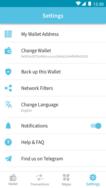
Are we deliberately making it so that the Settings screen's icons are filled with a single solid color whereas the tab bar icons are outlined?
At least on iOS system apps and many third party apps, the icons outlines are usually a bit thinner.
Could you adjust the Settings tab bar icons so they look like they have the same height? Eg. Settings icon look a bit shorter than DApps'. They might be the same height now, but they don't look the same to the human eye
To make it consistent, we can have Settings icons in light blue (as below):
or we can have Tab Bar icons solid (then we would need to have another icon for "Change Wallet")
It depends. There is no good practice here, there are many trends and styles. We need to make sure that they are not ambiguous and they are visible enough.
The one I made initially are 2 pt thick. The version below is 1.5 pt. And I do not recommend having 1pt as they won't be visible enough when coloured grey.
Got you. Please take a look at this one. Improved?
Thanks Tomek. I suggest we adopt the fill color for the Settings icons in this version:
The colors for the icons in this version of the Settings screen looks slightly better than the darker version and since it's the Settings screen it doesn't need the emphasis from the darker colors. Another reason being in iOS, the status bar isn't darken to match the darker icons. Alternatively, I can tint the colors differently match this version just in iOS when rendering (then you don't have to produce 2 versions). This is possible only if the un-filled areas in the image have opacity=0.
Up to you.
Can you try to tweak both the Transactions and DApps/Browser icon a bit shorter than in this version?:
Since we are talking about the Settings screen icons. Can you also help to include icons for these:
Console (hboon: as in logging, errors, etc)
Clear Dapp Browser Cache
Reddit (hboon: along the lines of Facebook/Twitter)
(There's some difference between Android and iOS, we'll slowly match up where it's possible).